Thursday, 14 June 2012

drought dry artists' journal .....

I often count my blessings but most especially when I am out with my camera, or just with my eyes, transfixed by small details that others just pass by.  I live with a beautiful man who hasn't a creative bone in his body and he has learnt to wander off when we are travelling, as I become transfixed by the minutia or lost in awe as I photograph old peeling paint and decay.  Very often, most often, he will be ahead of me as I linger playfully with my camera, and he calls me over to an area where he says there are plenty of the patterns or marks that I love.  I actually think being with an odd ball like me has opened his eyes to the visual world around him - though he would deny that!  Anyway, I am very grateful to have been given these 'extra eyes' as they enrich my life.  I am sure that this holds true for all creative people.

This artist's book I made after visiting an area down on the border between New South Wales and Victoria.  I called the area home for about six years and had spent many many hours wandering out by the weir, a large dammed area of the Murray River.  On this particular visit the area and surrounds had been affected by fire and severe drought and what was normally a vast weir, was a mere trickle of creek following the old river course.   The remnants of old trees and their roots normally covered by water, were revealed - black, tortured, magnificent.


The book is a series of pen and ink, actually bamboo and stick drawings.  Some of the pages are lined with transparent paper on which I have made fine markings.  They overlay the drawings beneath and add another dimension.


I made a double cover for the book - one covered greyboard with one of the drawings attached front and back, and then a double hinged perspex cover actually attached to the original cover on the back only. The book itself is sewn with coptic binding.


I think the photographs speak for themselves.  The drawings are very spare but to me, remind me of the time I spent wandering amidst the scorched roots.  It reminds me of the desolation that was there at the time, when in happier days the hills around are lush green and the weir is huge and overflowing.

So, while the camera can do a fine job at recording what was seen,  I am going to try and be more diligent about making books which reveal what was felt.

Saturday, 9 June 2012

moeraki boulders - new zealand

I spent a few weeks on the South Island in New Zealand a couple of years ago and one of the things I was passionate about seeing, were the Moeraki Boulders on the Otago Coast.  They are phenomenal - at the end of this blog I have put in a few photos though I probably took a hundred and when next I go I will stay in the area so that I can view them over a couple of days, sunrise, sunset, tide in and out!  They captured not just my heart but my imagination - and my creative imagination foremost.  It has been a long time coming, but this artist's book is the first piece of art I am making in what I hope will be an ongoing exploration of work on these rare spherical boulders. (If you google Moeraki Boulders you will see a wealth of information out there on the web.)

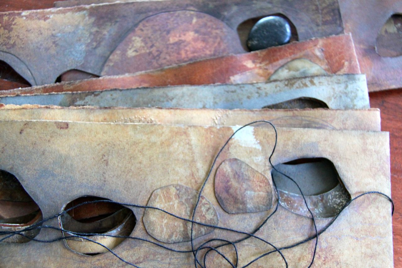
I decided that the smaller sheets of rusting I had done a week or so ago would be perfect to work into for this project.  I used various layers of ink to change the nature of the rusted paper and then did a mock up of the cutting out of the holes for my three boulders (small black pebbles).


As you can see in the couple of photographs below, the result of this inking left gorgeous residue on the paper below.  Why I NEVER remember to use some exquisite piece of french or italian, or khozo paper - anything but butchers' paper or newspaper, I will never know.  Probably because I am more focused on the images I am trying to produce than remembering the delicious happenstance effects that happen on the 'mop up' papers underneath.


For me this is rather  small book - not nearly as tiny and intimate as my tea bag book on 'A Sense of Place', but when closed it is only 9.5 cms x 28.5 but when opened, it means I am working on images that are 9.5 cms x 57 cms.  A shape I have always loved - very much a landscape shape.


I decided to restrict myself to the use of graphite, piercing, black linen thread and a little transparent paper. The cutout pieces of paper were too tempting not to use and though I am not a collage person, I did resort to bringing some of those elements into the design.


Although I do like the effect the collaged pieces bring to the page, I find myself wishing that the visual result on each page was worked into the paper and not onto the paper as I have done here on the cover of the book.


I am still playing with ideas about how each page, double page, should work and am trying to make each open page suggest different aspects of the boulders even though they all see the three stones poking through.  It is certainly still a work in progress but a little more work should see it complete.  Most of the design decisions have been made - the work just needs to be done.

Because I will be using coptic binding with this book, I have not yet stuck the pages together which means where I have glued transparent paper in some areas prior to piercing the paper, the paper is bending and protesting.  I am trusting that the pages will sit flat and a little less twisted once there is glue on both the surface the inside of the pages.


I think the colours and the sense I remember from the boulders, with the tide washing in and around them,    are starting to come together well.  I will be using the thread on only two of the six double pages and am leaving it quite loose to play around much like the water washing in and around the boulders.


I will post some photos of the books when completed next week.  Meanwhile, here are a few photos of the boulders ..........


Sunday, 3 June 2012

road trip book - journal

I was able to revisit a little journal I made a couple of years ago when I visited Wim and Del in their studio last week.  Sitting up high and dusty on a shelf, I was able to bring it down and take a few photos.  I should absolutely be more diligent about taking photos of my work.  I think blogging will help as I take photos now of both the making of a book or artwork, and then photograph the final piece.  This has not always been my practice though....

I made this book as a journal - titled 'road trip' hoping that some one would take it on one of their trips and write in it, thus adding to its character. White ink on the black and visa versa.  As it is, it works quite well in its perspex box as a little sculpture.  Maybe one day it will have a story to tell inside.


The partial partitions in the perspex box I made, allow the hinged ends to fan out.

Lots of threads left dangling .

Not how it is meant to sit but this is the way Wim has it standing up on a shelf in the studio.


Friday, 1 June 2012

a peek at my DaD book for 2006 .....

You can always tell when I am not completing anything in my studio - I revert to showing you peeks of things already done.  That is not to say that I don't have plenty going on in my studio - too much started really and not enough being completed!  Many ideas and some of these, finally, are working their way through to fruition.  Etchings mostly - and I find the who process time consuming and involved.  There is absolutely nothing like the marks we make with etching though - and the gorgeous plate tone, scratch marks on the plate which I love to leave as they tell their own story and the way you can blend your inks, different ways to wipe the plates etc.  Obviously a print lover!

And a book lover ..... In 2006 I decided to bind my year of drawings into monthly volumes.  I only made ten, though I will finish two more for the set.  I have bound them with a series of different bindings and will make a perspex box for them ... a showcase really of stitching techniques which will be helpful when I teach.


As you can see, I actually rusted or manipulated many of my pages before working into them as I found this way less intimidating that facing a blank page every day.  Very often what was on the paper suggested my drawing for the day.  In my former home we lined the road leading to the house with liquidambers.  I was told not to expect too much autumn colour here in tropical Queensland but you should see the magnificent colours each year.  (I now live a couple of hundred metres from this home so each time I drive by, I still get to enjoy the autumn colour.)


One of the techniques I love working with is using white ink on translucent paper over my drawings.  Now I pierce and scratch the transparencies but it is lovely to be able to look back through my DaD books and see when those ideas took root.


I have always really loved this drawing - the manipulation of the paper did much of the work and I only had to draw into it a little to suggest the dandelion.


I am a Andy Goldsworthy fan.  This was inspired by his 'Time' book.  Towards the end of 2010 my partner Steve and I went on a six day Art Refuge walk in Haute Provence, in France  - doing the walk with a guide, looking at various works Andy had installed in the region, actually sleeping (not that we actually did get any sleep on the hard floor) in one of the art refuges and being able to see his installation in both the evening and morning light.  Bliss.  The experience was one of my most favourite travelling experiences.


2006 led up to my divorce and there were plenty of these black hole days!  The nice thing about drawing a day, which is usually a very personal visual diary (until you post it on your blog!) is that you can indulge in these 'poor me' drawings and keep up the pretence on the outside!


This would be another of my favourite drawings because it encapsulates what the DaD project is all about - not meant to be little masterpieces but sketches that reflect your day.  I was obviously cleaning and being spring, bees had flown into the house and died on the window sills.


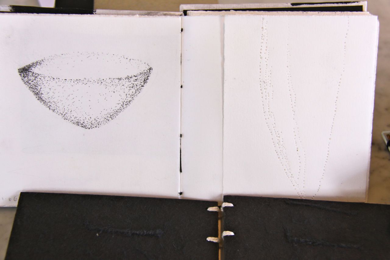
I use a number of  'symbols' repeatedly in my serious work.  (One day I will have a web site organised and share images from some of this work.)  Vessels and the elongated seed pod shape are two that I use for woman (the vessel) and man (the seed pod).  I have an on going body of work 'The Art of Language' where I have used these shapes in my etchings many times.  They appear in my large drawings too.  I also have a thing for crosses and squares!


I never would have thought I would put anything personal out there on the web - and look at me.  Think I am now just in such a happy part of my life that it no longer matters.